
Our group worked on the marketing plan, and we divided the task for three days, we did the basic work on Monday after the lecture and had a skype meeting on Tuesday. We completed our presentation on Thursday before the lecture.
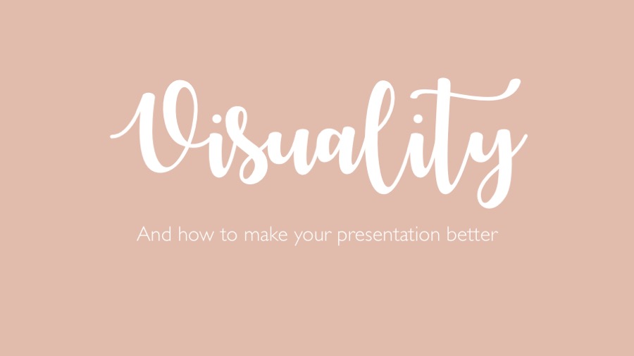
So not much to tell about that. But the one thing I was super excited about this week was my lecture on Friday. I give out a lecture about "visuality and how to make your presentation better" in a LaureaES's Cambridge Venture Camp. This was kinda my first lecture ever. I have once given a lecture about photography but it was not so official and more like a friend to friends situation.
Have to say that I was freeking out, that nervous I was even that the audience was small, it felt huge! But all my preperations paid out, and spending hours to the presentation and thinking that what I want to say was not wasted.
I thought about sharing some of those points I made in that presentation for you guys.
So what is visuality?
Visuality is simply how things look. Things can look bad, they can look good, or they can look average. With bit of a visual touch, you can transform anything into something better. Usually, people don't care what they things look like or care to use that extra 10 seconds to find a better-looking option to something.
A visual eye is something that you practice, and my background in photography has come handy in my job. By having a photography as a hobby for 10 years I had already eye to visual things and what looks good before I even knew what typography meant. But the thing is that you don't have to have that visual eye to make your presentation look good, since there are some guidelines and do’s and don’ts to avoid the biggest mistakes and awful looking things. There are couple main things that you can impliment into any visual thing not only presentations.

The use of colors is the most important thing when thinking about visuality. Use colors that suit your business or your style. Don't use screaming red if you have a relaxing spa and so on. Also take into a consideration how suitable the color is for the eye, or how common the color is. I have talked about this earlier in my blog. Take little bit extra time when you choose your colors, tone them up or down a bit instead taking the easy way. There are lots of different sliders ( RGB, CMYK, WEB) in powerpoint to tune your colors or you can choose whichever color you want, so why use those ones that everyone else uses too? Also mind the contrast also when using colors.
There can be too much or too little of contrast and always make sure that your text is visible enough to been actually written when using colors on the background or negative texts. (negative text= white text on any other color) I don’t recommend to use more than 5 colors and that includes black and white. You should pick one main color and then up to three complimentary colors. There are many color palette tools on the internet, personally really like https://coolors.co it is particularly very great tool, if you have already one color picked out and are looking for the complimentary colors.


Typefaces, fonts in the common language. There are three fonts in the standard computer that you should never use and those are Comic Sans, Papyrus, and Zapfino. basically, these fonts are the trash and there is always a better option. Only excuse to use a comic sans is in the cartoons speak bubble. Any font like this makes you look unprofessional. You really have to think what is the message you what to give out.
Arial, all of you know how it looks right? It is one of the most common fonts that there is out there. But only because it is common, doesn’t mean that it is the best option for your slides. To give out more interesting and not to so average slideshow, use some other similar looking font like the Sintony here. Same goes for the Times New Roman - use Garamond Instead.
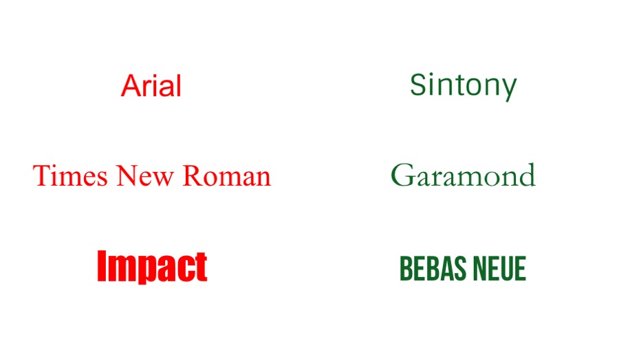
I don’t recommend using Serif fonts like TNR in presentations, but I will go over that in a sec. And if you think just for an extra second your font choice, it really makes a different. Don't go with the easiest choice. There are many free font options on the internet. Just search free fonts in Fontsquirrel, 1001fonts etc. Couple practical tips too; there is two kinds main font types, or font families. Serif, and Sans Serif, Sans Serif fonts are modern looking fonts without decorative finishes and easier to read. I recommend using Sans Serif fonts in presentation and in body text.
Mixing fonts and using space.
Serif and Sans Serif together usually create a nice contrast but in presentations limit the use sans in only headlines if necessary Never use more than three on the same page. Different cuts ( bold, italic, light) of the same font also counts. In the whole presentation, it can be more, don’t use more than three different fonts.
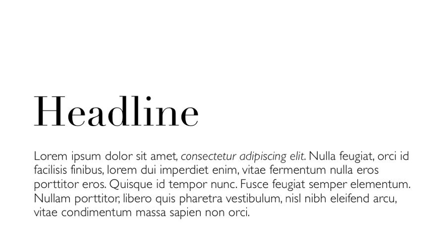
Space and its usage are what differentiates designers from other people. We work with space, and see it as part of the design As you can see from the picture, that by using white space over the headline I created a much more visually pleasing slide. there one overall rule for this; LESS IS MORE. and by that, I don't mean less space is better, but the other way around. Don’t over pack the slide with different elements, just keep it simple. Then it is more pleasing for the audience to adopt. Use space wisely, use it creatively. The empty space can be a very effective tool when used right.
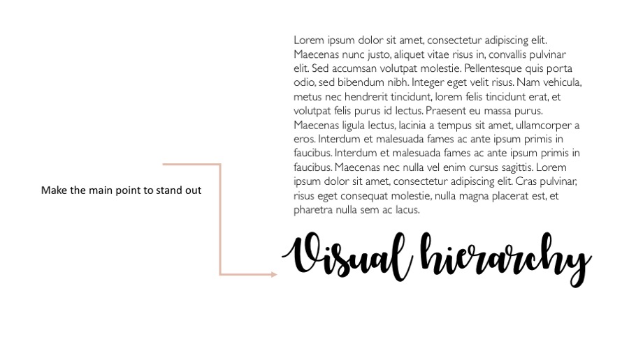
Another thing about space is visual hierarchy. It is as simply it is where the eye is guided to go. So guide the eye where it needs to go. This case the headline even that is on the bottom of the paragraph. So make sure that the main point stands out.
One last thing about powerpoint presentations; Skip the stock template. This means also the standard headline - bullet points set up. You can also create your own template if you want to use one but you don’t necessary need a template at all. I didn’t use template to create a slideshow. Be creative, think outside of the box. Powerpoint is not a design program, but there is still lots of things you can do with it. Go and discover. But if you feel that it is easier for you to use a template, There are multiple websites that sell professional looking powerpoint templates like Graphic River.net
So here you go, guys. I hope this helps you to create better-looking presentations in future. All of the pictures were made by PowerPoint btw. I am off to bed now and won't be participating on next week's lectures or tasks since tomorrow the time you are reading this it is my first day in my dream job in Microsoft. Wish me luck!
Ei kommentteja:
Lähetä kommentti