So the digital business course has come to its end. It has been a joyful ride, with valuable learnings. I have to say, it has been the best course so far in the time I have been in Laurea. The course had a very wide angle to marketing and digital business and we covered almost all of necessary to know for this state of our careers. A subject that really took it place in my memory was inbound marketing, a term, that I was not so familiar with earlier. The spark came from ECommerce fair when I listen to a keynote and took 5 pages of notes.
In summary, My course has looked this;
The first week, I was struggling to get back to writing a blog. The course seemed very interesting and I had high hopes for it. My hopes were archived and I in a matter of fact learned lots of new things. The second week, I wrote two blogs. First I raged about the fact that it is not acceptable to make students do jobs for free that should be reserved for professionals. That was and still isn't the purpose of an internship. That week I also wrote a blog about a video making and shared some tips I learned the hard way. The third week of blogging writing was the highlight of this blogging spring since it was selected to be the blog of the week. That blog was about visuality and what makes a good website, visually. A week after that, I wrote about copywrites and why they are important. I recommend reading that if you wonder where you can take pictures from. Rest of the February's blogs were not very special since I was absent one week. In the sixth week, we had an inspirational speech from Ronja Salmi, and I got really good writing tips.
In March we had the law week, which I was a bit disappointed with, The Ecommerce Fair and the super long post I wrote about it. The eight-week was very interesting also, circling around a subject of influencer marketing. The week after that was also interesting, we had a lecture about SEO and google analytics, all things useful for all marketers. I have also written about visuality, and how I gave my first lecture. In April, I started working full time, so I was absent for the rest of the course, unfortunately. But to compensate that I have already learned a lot while working. I wrote punch of compensatory posts, you can find them under here.
I have had a lot of fun on this course, and wish that there was more courses like this in Laurea. Maybe in future school system evolves into something more useful. :)

maanantai 24. huhtikuuta 2017
tiistai 18. huhtikuuta 2017
Study case of Seth Godin
Seth Godin is an American author, entrepreneur, marketer, and public speaker. My first touch to his speeches was in the live stream that we organized last fall for Nordic Business Forum 2016. He also writes a blog which you can find from here; http://sethgodin.typepad.com/
He is a writer and he believes that if you want to publish a book you have to write every day, so he writes something into his blog every day. He has been in the industry for over 20 years and he is really a guru when it comes to marketing.
On his speech about how to get ideas to spread he tells on the example of sliced bread, and it's up comings in its early days. Even that all we eat nowadays in sliced bread, no one bought it then. He also showcases some examples in that worked, but why they worked? Because someone figured out how to make customers feel like they need the product. Otherwise, your product is no good. Customers need to feel that they need your product and that is how you succeed. And customers these days just don't care, they have much more choices and less time to make a pick of the product. The obvious thing to do is just to ignore. Here he pulls out his famous purple cow example; if you see a cow while driving, you are just going to ignore it. But if the cow was purple, you would notice it. For a while, before it comes ordinary. This phenomenon can be seen in everything from marketing to news media. Everything remarkable is worth of attention.
There is much what he covers in this short speech but much of it is relevant to your course. Godin really dives deep to a basic idea of marketing and how it is something done wrong. The basic idea of marketing in to get your ideas to spread, and that is what he is saying. Don't do average mass marketing to average people, who are most likely to ignore you when consuming massive amounts of marketing in a daily basis. The key to spreading ideas to market to the target group, to the early adapters, because others will follow. Because those who love it will talk like crazy about it. and when people talk highly about your product, it is free marketing. For those first adapters, your new product is remarkable with a less effort than for average people. If one would market to the average people, it would not create same kinda hype that it would when marketing is targeted to fast adapters, those who seek out the best and newest things in their industry.
Being remarkable and focusing on those you want them to focus on. but you don't have to be super remarkable, you don't have to be the best. But very good is not good enough. Very good is averige. What you really have to do is figure out what people want and give it to them.
His speech really sums up everything we have learned, to buyer personas to creative marketing. I highly recommend watching couple of his speeches.
Tips & tricks to blogspot
I have really enjoyed this required blogging this spring. I made my first blog in 2008 when I was in 13. I wrote a blog on & off for three years from 2011 until I stopped from lack of free time. It was a shame since I was really surprised that I enjoy blogging as much as I do as part of this course.
I still invested lots of time on my blogs visual look and learned many tips and tricks during that time. Here is some that I have implemented or previously used on my blog.
How to get the picture as wide as a text?
First of all, you have to find out how wide your text part of your blog is. This is found under the Theme- section. Click Edit, and select the Adjust with. There you can see what is the width of your whole blog and the column section. With little math, you are left with the width of your text area. My blogs texts area is 1000 px wide but I edit my pictures to be 900px so it sits nicely together.
There are multiple free softwares on the internet to size down your pictures, so you don't need Photoshop for that. Why I recommend this; well take a look and say which one of these previews look better;
There are as many banners that there are blogs.
What comes to your banner, that is for you to decide; I recommend your banner to be as wide as you blog is. In my case, my banner is bit smaller since the default size is 60 px smaller than the width of my blog. Again, you don't need photoshop to create your banner, use Canva instead. If you already have a picture you want to use, you can smaller it to the desired size using free online tools. Note that good banner should not be too high. Take into consideration what your blog looks like when you first land on it.
While uploading your banner from "ulkoasu" part of the settings, select "Otsikon ja kuvauksen tilalla" ( instead of headline & insert") to hide the headline of your blog.
If you want your banner to be smaller, but centered; here is a trick;
#header-inner img {margin: 0 auto;}
The above is CSS- code that can be used to change your blog's appearance when normal tools can't. That particular code is for centering the banner.
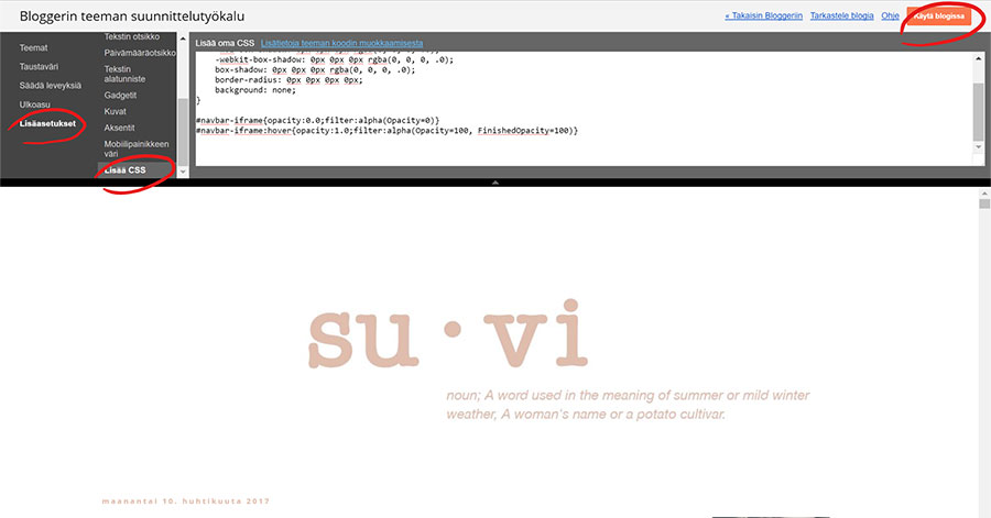
You can add CSS- codes while editing your theme. Click more settings and scroll down to CSS and paste your code to there. Click apply (käytä blogissa) after this to save the settings.
Removing the picture boxes
Blogspot has one little thing that annoys me when it comes to pictures. While back when I was updating a photography blog, it really struck out. The borders around the pictures. Code for that;
.post-body img, .post-body .tr-caption-container, .ss, .Profile img, .Image img,
.BlogList .item-thumbnail img {
padding: none !important;
border: none !important;
background: none !important;
-moz-box-shadow: 0px 0px 0px transparent !important;
-webkit-box-shadow: 0px 0px 0px transparent !important;
box-shadow: 0px 0px 0px transparent !important;
}
Don't leave anything out.
Side banner links
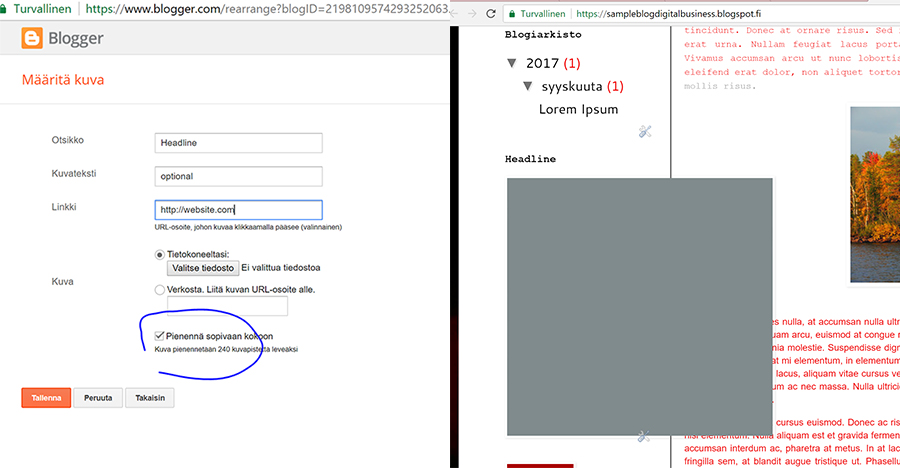
You can add more gadgets from the "ulkoasu" - menu. Click "add a gadget" and select "picture". You can find free social media icons for example here.
Then fill in the information you want, don't forget the link you want the picture to take you. Make sure the click "Make picture thisandthis wide" to avoid the following situation;
Other code magic
With little code magic, you can also choose any color ever for your highlight color, from not only those you can choose in a text editor, for example, the pink I use is #e1bcac. When writing your text, highlight the text you want to change color, and then change it any color. Then go to HTML side of the editor and find the text chapter you just highlighted. Find the part that says; color: #ea9999, or any other number in this case. If you changed it to red it would be #FF0000 and so on. Change this color number to whatever number you want, in my case, it is the #e1bcac so it matches to my other visual elements on the site.
If you want to find your own color to use, here is a useful link.
If you want your sidebars pictures to appear without a headline, for example, if you want them to be just pictures add <!> in the "headline" part when editing the gadget box. Also If you want to line your text to multiple lines in the sidebars use a <b /> in between the lines. <b/ > is equal to pressing enter in your HTML code.
I have also hidden my navigation bar, which is also a CSS code you can add while editing your theme;
#navbar-iframe{opacity:0.0;filter:alpha(Opacity=0)}
#navbar-iframe:hover{opacity:1.0;filter:alpha(Opacity=100, FinishedOpacity=100)}
Also a good tip, you want to be able to edit your text in HTML - mode in text editor and are writing your text somewhere else than blogspots text editor. If you paste your texts from there straight to the normal text editor, your text on the HTML side will look very confusing, since you will paste also all the preset design your text have with the text. Meaning fonts, sizes etc. So If you have selected a font you want to use in your blog, it will not show. Cure to this is to paste text straight to the HTML side.
Centering your post headline and date happens also in CSS editor with this little piece of code;
.post-title {
text-align:center;
}
For the headline and this for the date;
.date-header {
text-align:center;
}
There are multiple ways to edit the appearance of your blog. There is no right way, there is only your way. Go and be creative with your blog.
maanantai 10. huhtikuuta 2017
I value sleep.
Around the time last nigth when I was getting ready to go to sleep, there was not very many blogposts posted. And as I was absent during last week, I was supposed to find out from other peoples blogs what was discussed. And since I value sleep, I was not gonna stay up late just to wait around others to publish their blogposts and then start writing.
Others than blogs there was one blurry video posted about website UX, if I understood correctly since both image and audio quality was not good enough to me to actually find out what was the lecture about. Sadly no slides were posted, and I was unable to do notes from the lecture, because I could see the slides properly.
Based on those blogs that were very early to me to start writing this at bearable time, the topics discussed were digitalisation and wedsite UX and workshop about improving ones perform skills.
So Digitalization, "Integration of digital technologies into everyday life by the digitization of everything that can be digitized." I have no idea what was discussed furthermore in the class, and I don't want to copy paste from some else's blog.
the future of technology is already here but are you and your business using it to its fullest potential? People take a time to adapt to the news things, like the traditional taxi drives shaming Uber from taking their markets, when they could have made the same, used a similar app to distribute their services but they didn't. Because change is scary and why to change something that is already working?
This week we were also shared the feedback from of the lecture. I indeed have some feedback to give about this course. I think there are subjects that could be more useful and then topic that should have been discussed in early on the course like website UX, SEO, social media and social media marketing and all the inspirational/personal branding lectures could have been on the end part of the lecture; when the projects are already planned and almost ready. And lectures I would have wanted to see, or I could be useful for future students of this course like if we have 5 lectures about personal branding, why not one about the importance of LinkedIn and how to make a killer profile and get founded as a talent. If you read my old post, you can see some topic I wish we would have had. I will write about LinkedIn as my compensation post since I was founded that way and now I work for Microsoft.
One thing that I have thought would have been useful is how to give feedback, and then make students to comment each others blogs.
Apparently, this week there was also a lecture about web design and user experience. I tried to listen to the video of that lecture but the quality of the image was too poor for me to actually read the slides, and the audio wasn't the greatest either. You can read my previous blog post about web design here.
How has my week been? Well on Monday, I started a new job at Microsoft Finland as a Creative Marketing Intern. Everyone in there is wonderful, and the food. I had a tiny white-thrash-moment since I literally cannot even. The food is ten times better than in our school cafeteria, and there is always at least eight options to salad, wok to freashly grilled things. I might not know how to cook, but I do love to eat.
As I already said that I value sleep, I didnt post this yesterday, since I was so tired and went to sleep early.
maanantai 3. huhtikuuta 2017
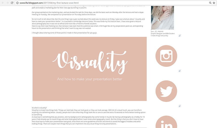
My first lecture ever
This week in school we had a bit different task. On Monday we were given a task by Heinon Tukku Oy, a food wholesale company, to track the customer path and create a marketing plan for their new app launching in autumn.
Our group worked on the marketing plan, and we divided the task for three days, we did the basic work on Monday after the lecture and had a skype meeting on Tuesday. We completed our presentation on Thursday before the lecture.
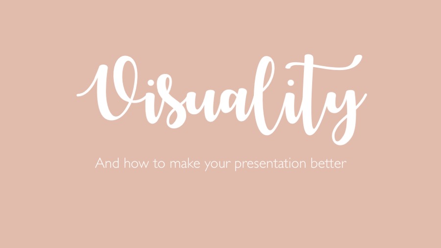
So not much to tell about that. But the one thing I was super excited about this week was my lecture on Friday. I give out a lecture about "visuality and how to make your presentation better" in a LaureaES's Cambridge Venture Camp. This was kinda my first lecture ever. I have once given a lecture about photography but it was not so official and more like a friend to friends situation.
Have to say that I was freeking out, that nervous I was even that the audience was small, it felt huge! But all my preperations paid out, and spending hours to the presentation and thinking that what I want to say was not wasted.
I thought about sharing some of those points I made in that presentation for you guys.
So what is visuality?
Visuality is simply how things look. Things can look bad, they can look good, or they can look average. With bit of a visual touch, you can transform anything into something better. Usually, people don't care what they things look like or care to use that extra 10 seconds to find a better-looking option to something.
A visual eye is something that you practice, and my background in photography has come handy in my job. By having a photography as a hobby for 10 years I had already eye to visual things and what looks good before I even knew what typography meant. But the thing is that you don't have to have that visual eye to make your presentation look good, since there are some guidelines and do’s and don’ts to avoid the biggest mistakes and awful looking things. There are couple main things that you can impliment into any visual thing not only presentations.

The use of colors is the most important thing when thinking about visuality. Use colors that suit your business or your style. Don't use screaming red if you have a relaxing spa and so on. Also take into a consideration how suitable the color is for the eye, or how common the color is. I have talked about this earlier in my blog. Take little bit extra time when you choose your colors, tone them up or down a bit instead taking the easy way. There are lots of different sliders ( RGB, CMYK, WEB) in powerpoint to tune your colors or you can choose whichever color you want, so why use those ones that everyone else uses too? Also mind the contrast also when using colors.
There can be too much or too little of contrast and always make sure that your text is visible enough to been actually written when using colors on the background or negative texts. (negative text= white text on any other color) I don’t recommend to use more than 5 colors and that includes black and white. You should pick one main color and then up to three complimentary colors. There are many color palette tools on the internet, personally really like https://coolors.co it is particularly very great tool, if you have already one color picked out and are looking for the complimentary colors.
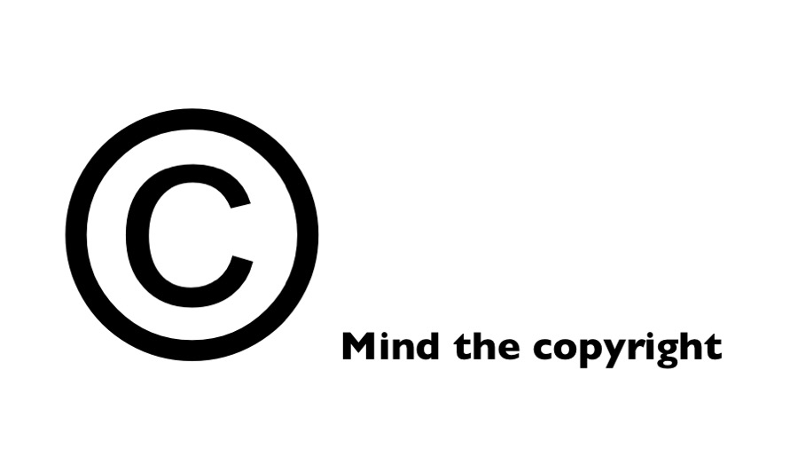 I have also written a post about this earlier. Other thing to know about pictures is to not make them bigger than they are, avoid using crappy quality and avoid pic collages. Those things are just nasty looking.

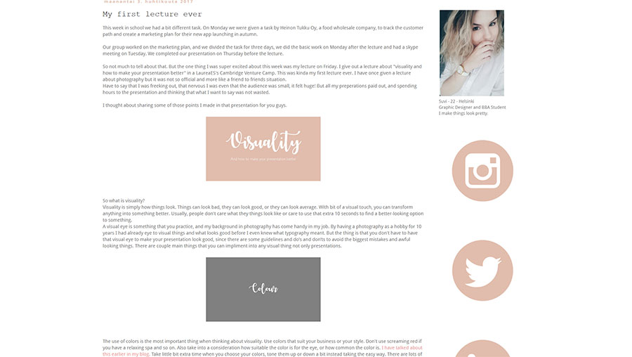
Typefaces, fonts in the common language. There are three fonts in the standard computer that you should never use and those are Comic Sans, Papyrus, and Zapfino. basically, these fonts are the trash and there is always a better option. Only excuse to use a comic sans is in the cartoons speak bubble. Any font like this makes you look unprofessional. You really have to think what is the message you what to give out.
Arial, all of you know how it looks right? It is one of the most common fonts that there is out there. But only because it is common, doesn’t mean that it is the best option for your slides. To give out more interesting and not to so average slideshow, use some other similar looking font like the Sintony here. Same goes for the Times New Roman - use Garamond Instead.
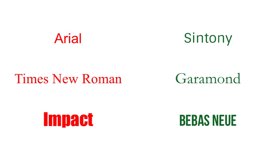
I don’t recommend using Serif fonts like TNR in presentations, but I will go over that in a sec. And if you think just for an extra second your font choice, it really makes a different. Don't go with the easiest choice. There are many free font options on the internet. Just search free fonts in Fontsquirrel, 1001fonts etc. Couple practical tips too; there is two kinds main font types, or font families. Serif, and Sans Serif, Sans Serif fonts are modern looking fonts without decorative finishes and easier to read. I recommend using Sans Serif fonts in presentation and in body text.
Mixing fonts and using space.
Serif and Sans Serif together usually create a nice contrast but in presentations limit the use sans in only headlines if necessary Never use more than three on the same page. Different cuts ( bold, italic, light) of the same font also counts. In the whole presentation, it can be more, don’t use more than three different fonts.
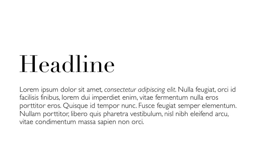
Space and its usage are what differentiates designers from other people. We work with space, and see it as part of the design As you can see from the picture, that by using white space over the headline I created a much more visually pleasing slide. there one overall rule for this; LESS IS MORE. and by that, I don't mean less space is better, but the other way around. Don’t over pack the slide with different elements, just keep it simple. Then it is more pleasing for the audience to adopt. Use space wisely, use it creatively. The empty space can be a very effective tool when used right.
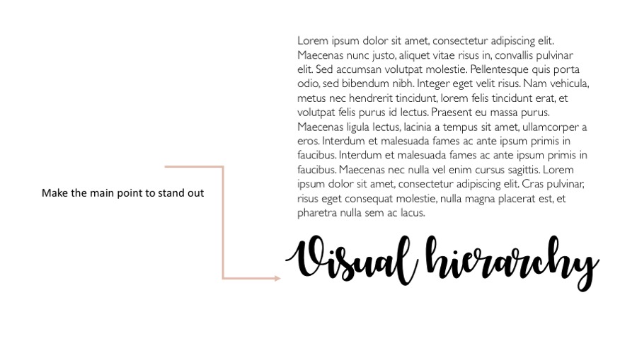
Another thing about space is visual hierarchy. It is as simply it is where the eye is guided to go. So guide the eye where it needs to go. This case the headline even that is on the bottom of the paragraph. So make sure that the main point stands out.
One last thing about powerpoint presentations; Skip the stock template. This means also the standard headline - bullet points set up. You can also create your own template if you want to use one but you don’t necessary need a template at all. I didn’t use template to create a slideshow. Be creative, think outside of the box. Powerpoint is not a design program, but there is still lots of things you can do with it. Go and discover. But if you feel that it is easier for you to use a template, There are multiple websites that sell professional looking powerpoint templates like Graphic River.net
So here you go, guys. I hope this helps you to create better-looking presentations in future. All of the pictures were made by PowerPoint btw. I am off to bed now and won't be participating on next week's lectures or tasks since tomorrow the time you are reading this it is my first day in my dream job in Microsoft. Wish me luck!
Our group worked on the marketing plan, and we divided the task for three days, we did the basic work on Monday after the lecture and had a skype meeting on Tuesday. We completed our presentation on Thursday before the lecture.
So not much to tell about that. But the one thing I was super excited about this week was my lecture on Friday. I give out a lecture about "visuality and how to make your presentation better" in a LaureaES's Cambridge Venture Camp. This was kinda my first lecture ever. I have once given a lecture about photography but it was not so official and more like a friend to friends situation.
Have to say that I was freeking out, that nervous I was even that the audience was small, it felt huge! But all my preperations paid out, and spending hours to the presentation and thinking that what I want to say was not wasted.
I thought about sharing some of those points I made in that presentation for you guys.
So what is visuality?
Visuality is simply how things look. Things can look bad, they can look good, or they can look average. With bit of a visual touch, you can transform anything into something better. Usually, people don't care what they things look like or care to use that extra 10 seconds to find a better-looking option to something.
A visual eye is something that you practice, and my background in photography has come handy in my job. By having a photography as a hobby for 10 years I had already eye to visual things and what looks good before I even knew what typography meant. But the thing is that you don't have to have that visual eye to make your presentation look good, since there are some guidelines and do’s and don’ts to avoid the biggest mistakes and awful looking things. There are couple main things that you can impliment into any visual thing not only presentations.
The use of colors is the most important thing when thinking about visuality. Use colors that suit your business or your style. Don't use screaming red if you have a relaxing spa and so on. Also take into a consideration how suitable the color is for the eye, or how common the color is. I have talked about this earlier in my blog. Take little bit extra time when you choose your colors, tone them up or down a bit instead taking the easy way. There are lots of different sliders ( RGB, CMYK, WEB) in powerpoint to tune your colors or you can choose whichever color you want, so why use those ones that everyone else uses too? Also mind the contrast also when using colors.
There can be too much or too little of contrast and always make sure that your text is visible enough to been actually written when using colors on the background or negative texts. (negative text= white text on any other color) I don’t recommend to use more than 5 colors and that includes black and white. You should pick one main color and then up to three complimentary colors. There are many color palette tools on the internet, personally really like https://coolors.co it is particularly very great tool, if you have already one color picked out and are looking for the complimentary colors.
Typefaces, fonts in the common language. There are three fonts in the standard computer that you should never use and those are Comic Sans, Papyrus, and Zapfino. basically, these fonts are the trash and there is always a better option. Only excuse to use a comic sans is in the cartoons speak bubble. Any font like this makes you look unprofessional. You really have to think what is the message you what to give out.
Arial, all of you know how it looks right? It is one of the most common fonts that there is out there. But only because it is common, doesn’t mean that it is the best option for your slides. To give out more interesting and not to so average slideshow, use some other similar looking font like the Sintony here. Same goes for the Times New Roman - use Garamond Instead.
I don’t recommend using Serif fonts like TNR in presentations, but I will go over that in a sec. And if you think just for an extra second your font choice, it really makes a different. Don't go with the easiest choice. There are many free font options on the internet. Just search free fonts in Fontsquirrel, 1001fonts etc. Couple practical tips too; there is two kinds main font types, or font families. Serif, and Sans Serif, Sans Serif fonts are modern looking fonts without decorative finishes and easier to read. I recommend using Sans Serif fonts in presentation and in body text.
Mixing fonts and using space.
Serif and Sans Serif together usually create a nice contrast but in presentations limit the use sans in only headlines if necessary Never use more than three on the same page. Different cuts ( bold, italic, light) of the same font also counts. In the whole presentation, it can be more, don’t use more than three different fonts.
Space and its usage are what differentiates designers from other people. We work with space, and see it as part of the design As you can see from the picture, that by using white space over the headline I created a much more visually pleasing slide. there one overall rule for this; LESS IS MORE. and by that, I don't mean less space is better, but the other way around. Don’t over pack the slide with different elements, just keep it simple. Then it is more pleasing for the audience to adopt. Use space wisely, use it creatively. The empty space can be a very effective tool when used right.
Another thing about space is visual hierarchy. It is as simply it is where the eye is guided to go. So guide the eye where it needs to go. This case the headline even that is on the bottom of the paragraph. So make sure that the main point stands out.
One last thing about powerpoint presentations; Skip the stock template. This means also the standard headline - bullet points set up. You can also create your own template if you want to use one but you don’t necessary need a template at all. I didn’t use template to create a slideshow. Be creative, think outside of the box. Powerpoint is not a design program, but there is still lots of things you can do with it. Go and discover. But if you feel that it is easier for you to use a template, There are multiple websites that sell professional looking powerpoint templates like Graphic River.net
So here you go, guys. I hope this helps you to create better-looking presentations in future. All of the pictures were made by PowerPoint btw. I am off to bed now and won't be participating on next week's lectures or tasks since tomorrow the time you are reading this it is my first day in my dream job in Microsoft. Wish me luck!
Tilaa:
Blogitekstit (Atom)